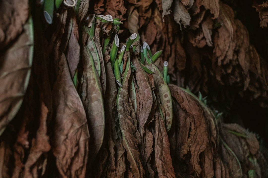
Pantone 448 C is a drab, dark brown color known as “the world’s ugliest color” among the public. Its Hex code in digital environments is #4A412A.
Origin of Global Fame
The reason this color gained global fame is a market research conducted by the Australian government in 2012 to reduce tobacco consumption. Researchers worked to find the color that was “least appealing” to the human eye, evoking death, dirt, tar, and low quality in consumers, and consequently settled on Pantone 448 C.
Naming Change Process
When the Australian Department of Health decided to apply the color to packages, it officially described the hue as “olive green” in official documents. However, the Australian Olive Association strongly objected, feeling discomfort that their products were associated with concepts like “the world’s ugliest color” and cigarette packaging. Following this, the government backed down and changed the color’s description to “drab dark brown“.
Today, this psychological deterrence strategy initiated by Australia has been adopted by many countries including Turkey, the United Kingdom, France, Israel, and New Zealand, and is used as the standard background color for plain cigarette packaging.
The Truth Behind the “World’s Ugliest Color” Title
The main factor behind Pantone 448 C [cite: 1.1.3] being referred to as “the world’s ugliest color” is the study conducted in Australia in 2012. In the research, carried out by the research company GfK Bluemoon at the request of the Australian Government and involving approximately 1000 cigarette consumers, this hue was found to be the most repulsive by participants. Following the research, international media reporting the issue in this manner led to the color being recognized with this title worldwide.
However, this designation is not a universal or scientific reality, but an informal public perception based on market research. Color experts and the Pantone Color Institute do not agree with this characterization [cite: 1.1.1]. Experts state that no color can be “the most beautiful” or “the ugliest” on its own, and that color perception is entirely shaped by the context in which it is used. Considered a rich earth tone in nature, this color also appears in the clothing details of Leonardo da Vinci‘s Mona Lisa painting in art history [cite: 1.1.1]. The repulsive perception of the color stems from the human mind associating it with negative elements such as dirt, decay, or cigarette packages.
Current Status and Developments
The use of Pantone 448 C and plain packaging has become a global public health standard today. This process, which began solely with Australia in 2012, has gained widespread acceptance globally, also encouraged by the World Health Organization (WHO).
Global Prevalence
Today, the Pantone 448 C background color is a legal requirement for tobacco products in over 25 countries, including Turkey (2020), the United Kingdom, France, Canada, the Netherlands, Belgium, Singapore, Israel, Denmark, Finland, and New Zealand. Dozens of other countries are in the process of legislating or implementing this regulation [cite: 1.1.2].
Expansion of Scope
While the application initially covered only traditional cigarette packages in its early years, some countries are now expanding this drab color standardization to include heated tobacco products, cigars, and e-liquid packaging.
Impact and Debates
Public health research indicates that color change alone is not a miraculous solution; however, by removing brand logos and attractiveness and highlighting large health warning visuals, it has reduced smoking initiation rates, especially among young people. Tobacco manufacturers, on the other hand, continue their legal and commercial objections against the implementation, arguing that plain packaging facilitates counterfeiting and increases illicit tobacco trade.
Status in Design and Popular Culture
The declaration of the color as “the world’s ugliest color” has had an inverse effect in popular culture, increasing curiosity about the color. Today, some alternative clothing brands and independent designers use this hue in their collections as an ironic accent or as part of a natural earth tone aesthetic.
Leave a Reply